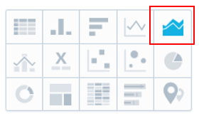
Stacked Area Chart
- 11 Jul 2023
- 1 Minute to read
- Print
- DarkLight
Stacked Area Chart
- Updated on 11 Jul 2023
- 1 Minute to read
- Print
- DarkLight
Article summary
Did you find this summary helpful?
Thank you for your feedback!
A stacked area chart is very similar to a trend line, except you can choose a maximum of three variables instead of two in a trend line. To create a stacked area chart:
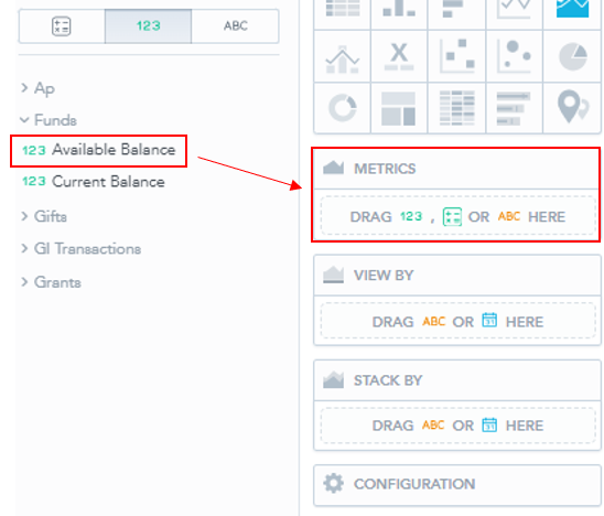
1. Select a "Metric" (variable) to display in your Visual. Either explore the dropdowns on the left or use the search bar to find your desired variable. Then, drag and drop the variable into the "Metrics" box.
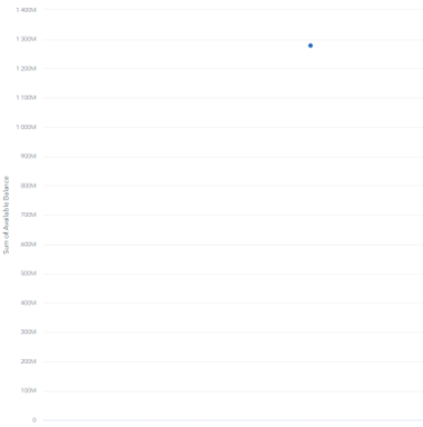
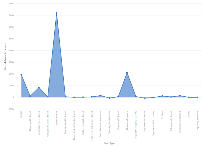
- This should create the following visual:
2. Now select a secondary and tertiary variable to modify the Metric. This can be anything related to the original variable.
- Drag and drop the secondary variable into the view by box.
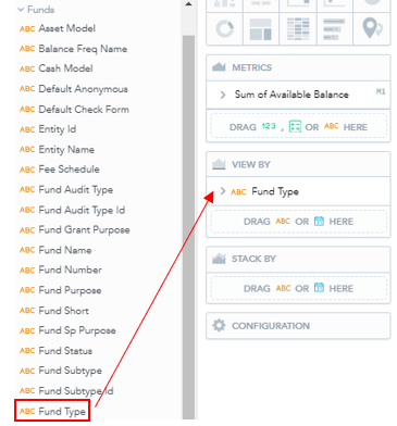
- This will create a stacked chart as opposed to the single data point above:
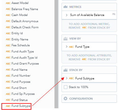
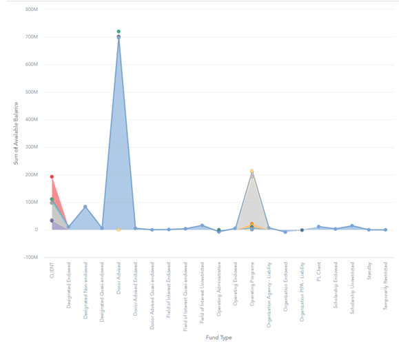
- If you desire a third variable, select from the list on the left and drag it into the "Stack By" box.
- This will separate the fund types into their subtypes and create the following chart:
3. if you wish to filter the data see Filtering Data.
4. Click Save to save the Insight, which will automatically populate in the current Dashboard.
Was this article helpful?