Configuring Insights
- 07 Jul 2023
- 2 Minutes to read
- Print
- DarkLight
Configuring Insights
- Updated on 07 Jul 2023
- 2 Minutes to read
- Print
- DarkLight
Article summary
Did you find this summary helpful?
Thank you for your feedback!
This section will explore the configuration of Insights. Depending on the Visual you have selected, you will be able to change colors, show/hide the X-Axis, Y-Axis, and Legend, and edit the depiction of data. Note that some Insights (like tables) do not support this function.
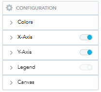
To access the Configuration menu, select your chosen Visual and find the “Configuration” icon. Click on it to view the following menu:
Changing Colors
Good Data applies colors to variables in the order of the current custom palate. If you wish to override this:
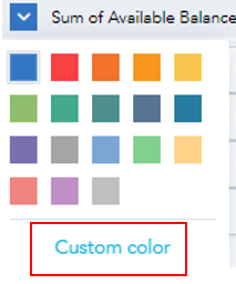
- Click on the heading “Colors” to open a dropdown of all variables that are currently being displayed:
- Click on each individual variable to change the color of it in your graph. You can either use the preset colors or create a custom palate.
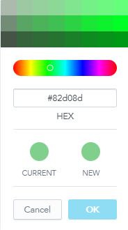
- Use the sliding color bar to adjust the color options at the top. If you have a specific color in mind, enter its hex code and click OK to apply changes to the Visual.
Editing the Axes
Good Data does not allow for changing the names of Axes (they are displayed as the names of the selected variables). However, you can edit the position and rotation of them, or choose to hide them entirely. To do so, click on either the X-Axis or Y-Axis dropdown from the Configuration menu.
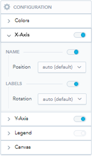
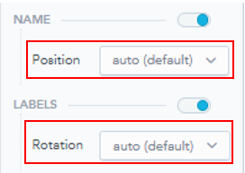
- Use the toggles next to any item (X-Axis, Y-Axis, Legend, Name, or Labels) to show or hide the item. If an item is not supported in the current Visual, the toggle will be grayed out (as it is for Legend in the above image).
- You can adjust the position of the Axis name and rotation of the Labels for both the X- and Y-Axis using the dropdown menus.
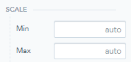
- You can also adjust the scale of the Y-Axis (and the X-Axis if you are using a Visual that supports two numeric Metrics). The platform will automatically create a scale, but you can type any number in the text boxes next to Min and Max to create your scale. Note that you cannot set an increment for the scale, because the platform will change the increments depending on the size of your Visual in a Dashboard.
Adjusting the Canvas
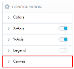
- You can find the options for adjusting the canvas by clicking on the dropdown next to “Canvas”.
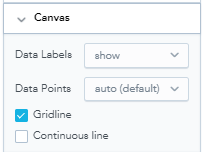
- These options change with the chosen visual, but you can typically use this function to change the view of data points. For this visual, we can show or hide data point labels and gridlines.
Was this article helpful?